Roles and Responsibilities
UI Overhaul
DSP is a fixed-architecture audio control and processing software by Extron. It's used to set up audio systems in venues ranging from conference rooms and university lecture halls to convention centers and stadiums.
DSP was first released in 2008, and in its decade and a half run it has been through a few iterations, two of which I have been a part of (versions 3 and 4). This case study covers the redesign from version 2 to 3.
Digital Signal Processor (DSP)
lead designer (2 UI, 1 UX)
new feature workflows
high-fidelity mockups
visual development
usability study consultant
The transition from Version 1 to Version 2 introduced several additional features. DSP Version 3 was focused on revitalizing its aging interface and refining feature workflows with quality-of-life improvements.
version 2
version 3

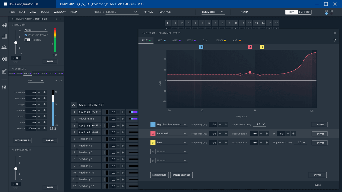
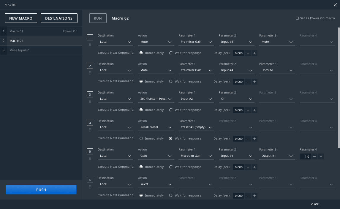
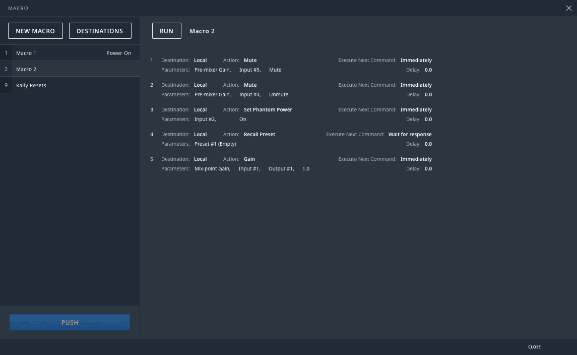
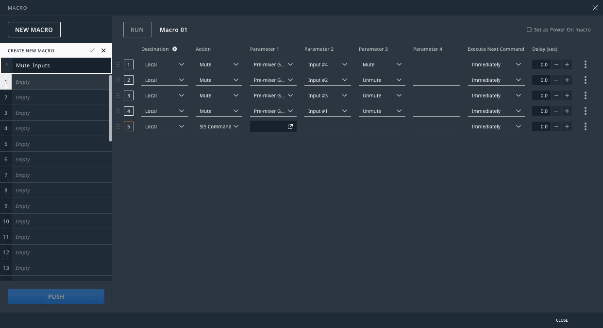
Similar to other production oriented software, the Device Workspace is the main focus of the application from which other features reference for further configurations.
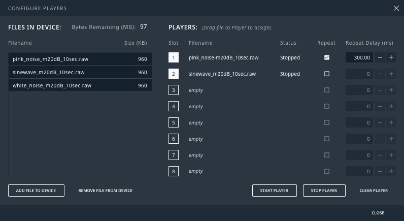
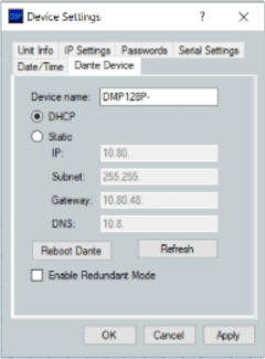
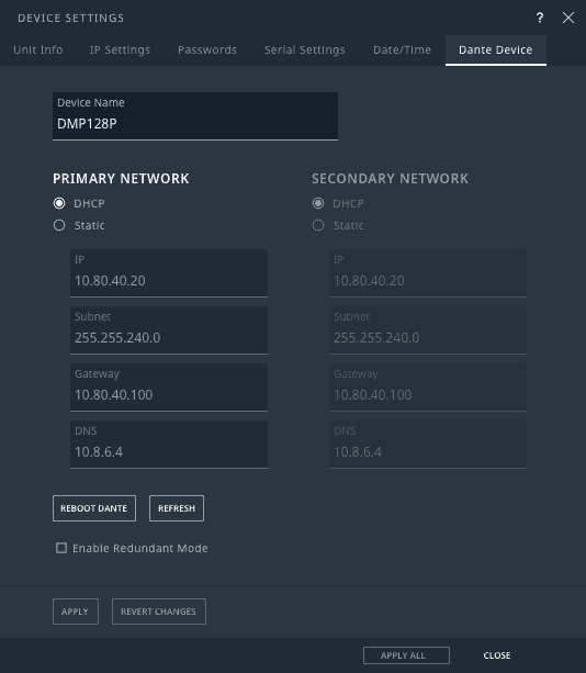
Some features were a close 1-to-1, simply updating component properties with the new values.
Other features had slight modifications to their workflows or layouts.
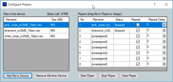
Sorry for the poor image quality. The provided source material was… limited.
Some features explored changes in approach but made sure to keep only what tested well with users.
Wireframes by Jeff Mason
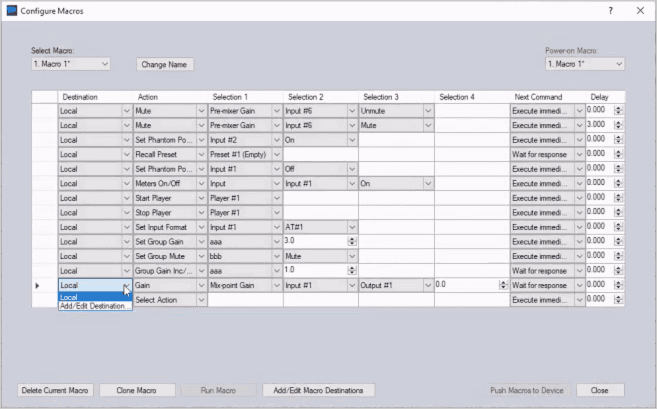
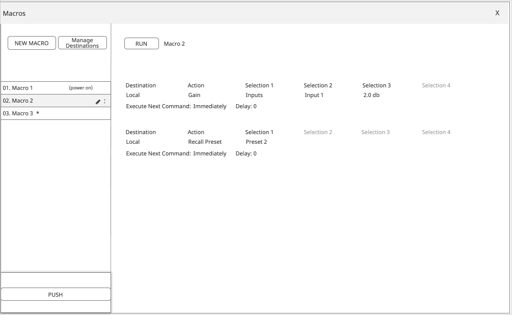
Macros had been this enormous window that the Product Owners wanted to be scaled down to have less of a footprint.
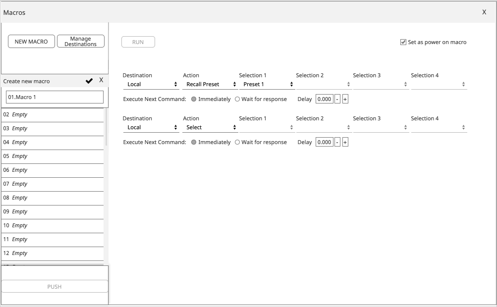
A few ideas were explored, but this approach of having a readOnly mode separate from an edit mode, both of which display each step as two lines, seemed the most viable.
But users HATED the layout! ._.
It's takes too long to parse!
I have to skip around to compare properties!
I can't see enough lines at once!
After some usability studies we saw good marks with having a separation between the two modes…
With our newfound knowledge as to why the table worked so well, we went back to the product owners and said, 'Sorry, it's actually going to be bigger than before! But for a good reason, the users want it that way.
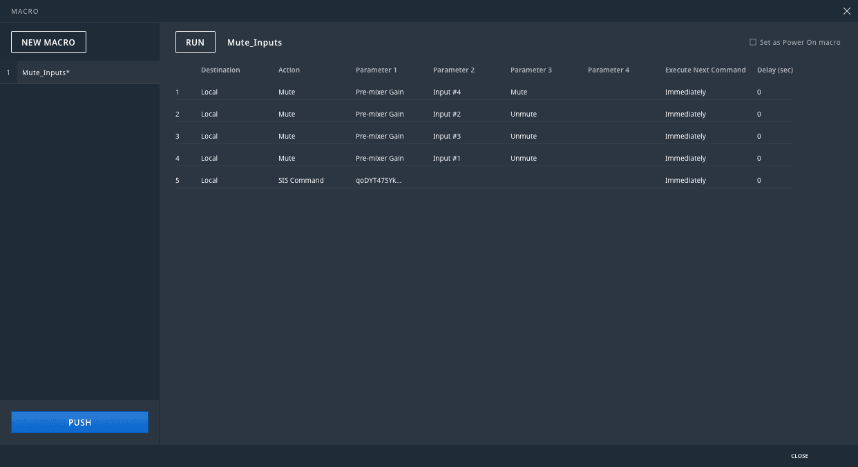
The general consensus was that splitting up the steps into different lines made it harder to compare values. Something a basic table is excellent at. Things were made worse when they could only compare 5 or 6 steps at a time!
Come to find out that most sets of steps needing to be compared were in sets of 8. Given the target screen size we were working with and the other UI constraints, we settled on displaying 16 lines.
The response in the second round of testing was a resounding sigh of relief.
While other features benefited from more extensive reworks.
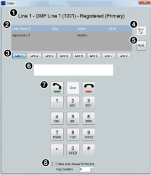
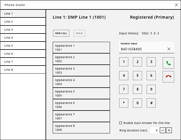
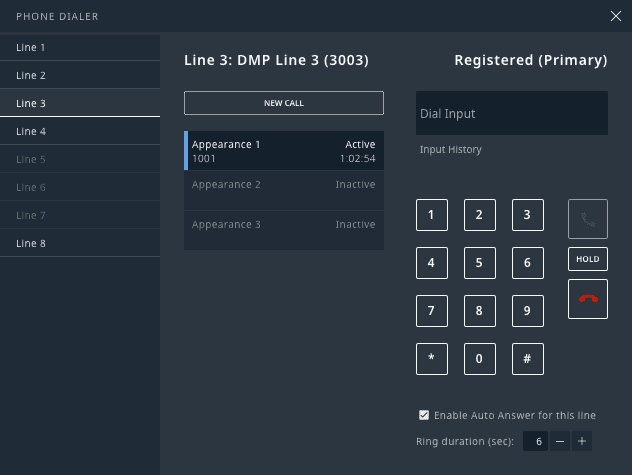
This feature enabled voice inputs from phone lines. When it was originally implemented, it was modeled after an office phone. Cute, but the flow of information in a digital interface is difficult to follow.
There are opportunities for improvement here…
I tend to start off quite rough (and admittedly rather ugly). Normally, I prefer pens, markers, and paper, but sometimes it's easier to stay digital.
I moved the "Line" buttons into a list because:
They dictate the scope of the content you're interacting with.
There is already precedence in the software for these kinds of list (see Macros)
The rest is roughed in, but I'm quick to address it with subsequent iterations.
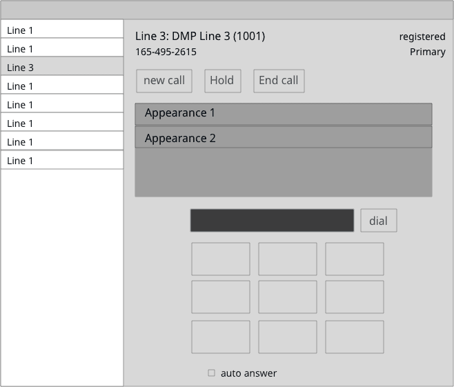
I'll start in a direction seemingly significant. If elements fall into place naturally, fantastic! But if they're not showing promise, I'll drop it and start in a different direction or treatment. Every action informs the next. Progress is a series of small, quick actions that get more refined as understanding is discovered.
A more realized idea of what could be, but now to see if it holds up in a more true environment.
This is working reasonably well. Let's see how it responds to a potential use case.

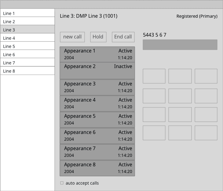
And now to swap in some system components…
… reasonable. Not perfect, but good enough.
Extron's DSP is a massive application. We touched on just a handful of features out of a few dozen, and that's not including the thoughts and strategies explored around workspace interactions, device management, onboarding, and so much more.
The precedents created by version 3 will continue to inform the new features and structures made available in version 4, but that's a story for another day.
Extensive Systems, Powerful Tools
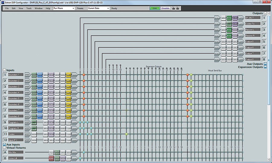
The concept needed to stay intact (input signals originating on the left, passing through various processors to a mix point before flowing to an output), but the visuals were refined to make it easier to trace signals through the system.